

In my previous two articles, I used principal component analysis and Gaussian mixture model clustering in order to create a new way of classifying different NBA players. The same data from those articles can be used to assess player similarity through hierarchical agglomerative clustering (HAC).
Hierarchical cluster analysis refers to the method of building a hierarchy of clusters. Hierarchical clustering can either be “bottom-up,” where you start with one cluster for each observation and merge similar clusters at each step of the hierarchy, or “top-down,” where you start with one cluster consisting of every observation which you split into small clusters at each step of the hierarchy. The former type of clustering is formally known as hierarchical agglomerative clustering. Here’s an example:
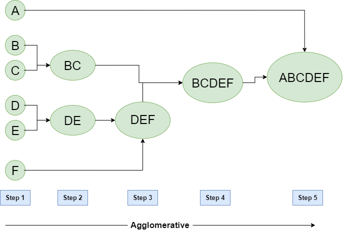
From the plot (which is known as a dendrogram), we can see that points B,C and D,E are very similar to one another. Point A is extremely dissimilar to all the other points — it wasn’t merged until the final step.
Now, imagine that every eligible1 NBA player from the 2019-20 season is represented by a single point. With 111 players in our analysis, we therefore start off with 111 separate clusters using agglomerative clustering. At each following iteration, the closest (most similar) pairs of clusters are merged until only one cluster is left.
How do we actually quantify the similarity between clusters in order to determine which combinations should be made at each step? One way is through the use of Ward’s minimum variance method. In this method, pairs of clusters are found at each step which will lead to the minimum increase in total within-cluster variance.
After applying Ward’s method, I was able to create the following dendrogram representing the cluster hierarchy of NBA players using the following code. The data collection involved in creating the data frame df is detailed here.
from sklearn.preprocessing import StandardScaler
from sklearn.decomposition import PCA
import scipy.cluster.hierarchy as shc
import matplotlib.pyplot as plt
import pandas as pd
import numpy as np

testdf = df[(df.MPG > 23) & (df.GP > 15) & (df.SEASON == '2019-20')].reset_index(drop=True)

features = [x for x in df.columns if (x != 'PLAYER_NAME') &  (x != 'POSITION') & (x != 'SEASON')]

x = testdf.loc[:, features].values
y = testdf.loc[:,['PLAYER_NAME']].values

x = StandardScaler().fit_transform(x) # standardize all values

pca = PCA(n_components=0.99)
principalComponents = pca.fit_transform(x)

plt.figure(figsize=(8,22))
plt.title('2019-20 NBA Hierarchical Clustering Dendrogram')
dend = shc.dendrogram(shc.linkage(x, method='ward'),labels=list(testdf.PLAYER_NAME),orientation='left')

plt.yticks(fontsize=8)
plt.xlabel('Height')

plt.tight_layout()

plt.show()
Okay, that’s a lot of information. If you read this from left to right, you’ll notice that this is essentially one huge cluster consisting of 195 players. This cluster consists of three smaller clusters, with each cluster consisting of smaller and smaller clusters until we reach the individual players.
This form of data visualization allows us to assess the similarity between various players. Here are a few points that stand out:
There are some results in there that don’t really make sense, but in general, I’m pretty happy with the results. I think it’s a really interesting visualization with a lot of cool insights.
The '2019-20' in the code can be easily replaced with any of the past seven seasons, so let’s go ahead and take a blast to the past by taking a look at a dendrogram of NBA players from the 2013-14 regular season.

There’s only two big clusters in this dendrogram. Interesting. Maybe it’s partially due to the greater prominence of the center position.
The LeBron James – Kevin Durant comparison is funny because of how many people were probably engaging in arguments about the two all-time greats after Durant’s historic MVP season in 2014. Those arguments were also being had in the past few years during Durant’s stint with the Warriors.
It’s also cool to see that the most similar player to Stephen Curry at this point was James Harden. Curry averaged 24 PPG for the 51-31 Warriors in 2014, while averaged 25 PPG for the 54-28 Rockets. They were both very good players at the time, but nobody could have predicted how good they became.
Alright, I’m gonna leave it at that. Observe some more cool stuff on your own, there’s plenty of information left in there. You can check out Part I and Part II from the series in which I previously compiled and utilized this data, along with all of the code from that series here in this GitHub repository.